Display Suite & Paragraphs Part 1
My wonderful boss, Jon Reid introduced me to paragraphs a few weeks ago. After a little digging, reading and research I knew I was in love! What a fantastic way to give users the keys (in a controlled environment of course) to design their pages! As a themer my goal is to ensure the client has a site that looks fantastic, is very usable and that they can update with ease. Paragraphs covers all those basis and with Display Suite integration is a winning combination.
Let’s talk setup. Basic setup requires the following modules:
The first thing we need to do is determine the types of content we want the user to have access to create. Today I’m going to create 4 basic paragraph bundles. They include:
- Text Full Width Blue Background
- Wrapping Text Left with Image Right
- 4 Columns with Images
- Gray Background Image Full Width
Now, I personally like to create the Display Suite templates next, so I have a visual on how things will look before creating the actual paragraph bundles. That also means once I create the bundle, I can update the display as soon as I create the fields. I’m going to utilize classes from the Bootstrap Framework (one of my favorites!).
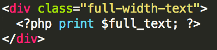
First off, within my page.tpl.php file I have the page content rendering by default at 100% width. I do this since I want some of my paragraph options to display at full width, while others will have the container classes within the Display Suite template. If you don’t want all the pages of your site to use 100% width you can create a custom content type and a custom template file (page--content_type.tpl.php) and attach the paragraph options to the new content type.
Display Suite Templates contain 3 files:
- .inc -> Tells Drupal the regions we’ll be using
- .tpl.php -> The template file
- .css -> Any additional styles we want to apply just to this template
The HTML will be placed in the .tpl.php file. We’ll start with the full width examples, since those will be relatively similar.
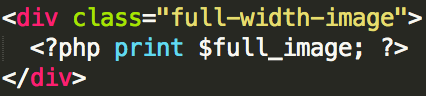
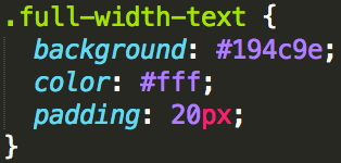
Now we will want to also create an image style for the full width image to make sure it’s not too high for the space. I’m going to set a maximum height of 400px, it seems like a nice height. We’ll also need to set some CSS for the blue background text, giving it the blue background and ensuring the text is white.
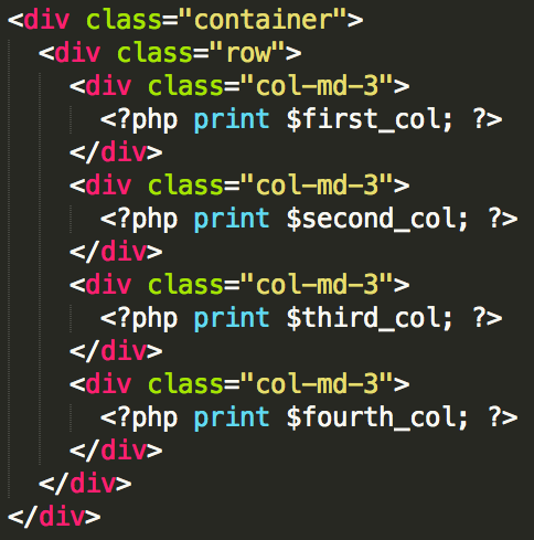
Next we’ll tackle the 4 columns with images. Now you could also create a paragraph that has 4 columns, you would just use text fields instead of images. You’ll notice for the HTML on this template (and the next) I’ve included the bootstrap “container” class. This makes the area a set width (1170px) and ensures it shrinks nicely across all viewing devices.
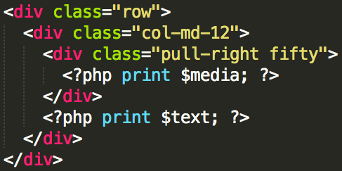
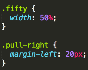
Our last template is for wrapping text. In this example I’m going to have my “media” (in this case an image) on the right with the text wrapping around the image on the left. We will need a bit of CSS in this template as well to add a margin between the image and the text and set the width of the image. I’m sure you might be thinking, “why don’t we just use bootstrap’s awesome columns?” Because we want the text to wrap around the image. If we wanted this in 2 columns that would be a great solution, but we just want the image floating to the right, taking up 50% width on the desktop view, with text wrapping around it.
Stay tuned to my next article when we incorporate the Display Suite templates into our site and configure all the paragraph bundles!
- Log in to post comments

 Function1, Inc. Copyright 2026. All Rights Reserved