Extending the Power of Pivot
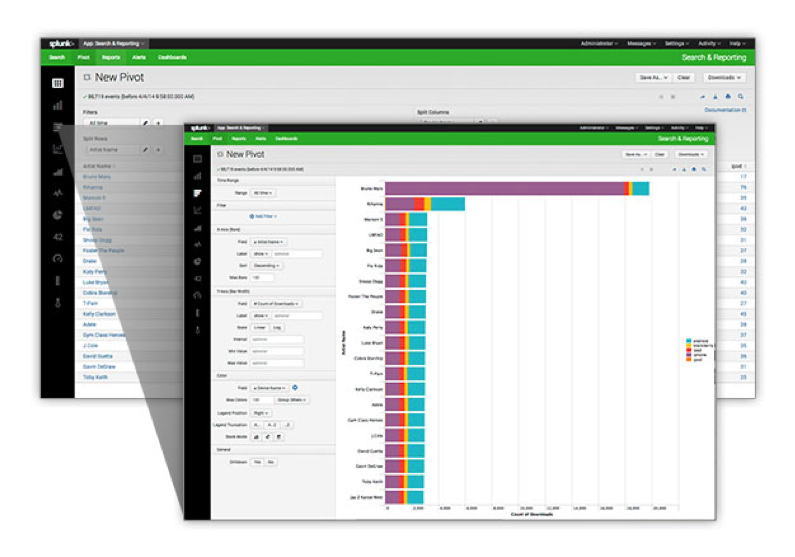
Data models were introduced with the release of Splunk 6 back in Oct of 2013. By now, Splunk users are aware of the pivot feature that allows them to build various types of reports that are fueled by data models without having to know the Splunk Search Processing Language (SPL). The Pivot Editor is a great way to build these reports, it allows users to simply point and click their way to creating reports/charts/graphs that provide great insight. This feature is great for users that only want to use the Pivot Editor to create their reports. However, you cannot add the Pivot Editor to a custom dashboard.
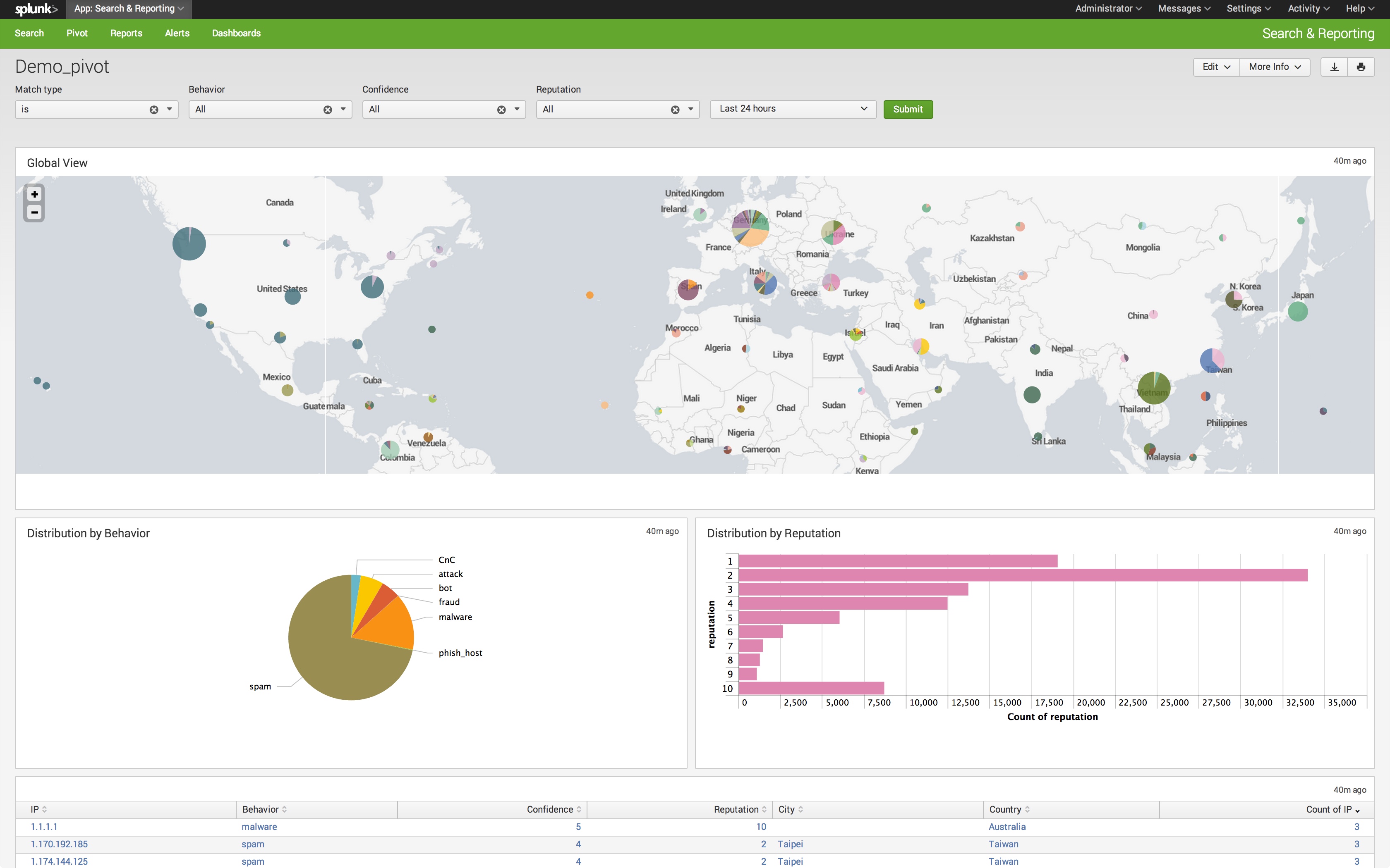
I was creating a custom dashboard for a customer recently and they liked the ease of use and functionality that the Pivot Editor provided, but they expressed interest in having similar functionality on their dashboards. Specifically, they wanted to have their accelerated data models fuel their dashboards (including a map), and be able to use the filter functionality that is built into the Pivot Editor.
You can create a graph or chart in the Pivot Editor and add it to a dashboard. This will create a panel on a dashboard that has a search fueled by your data model. However, you lose the ability to filter the data that is displayed and you cannot create a map visualization with the Pivot Editor.
Filtering
You can add the same filtering functionality that is on the Pivot Editor to your custom dashboards. You need to create user inputs, such as drop downs, for the fields you would like to use to filter your data.

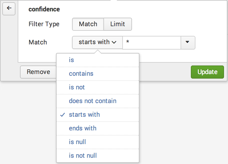
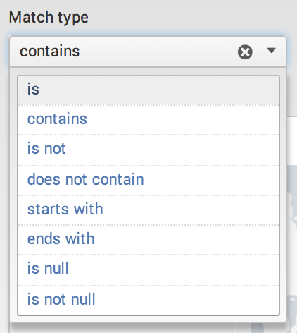
Also, add a drop down that contains the match type you would like to use to filter with using the token "filter".
Once your user inputs and match type dropdown are created, edit the search string for each panel you wish to filter. Below is an example of a search that was created by using the Pivot Editor:
| pivot Demo DeepSight_IP count(behavior) AS "Count of behavior" SPLITROW behavior AS behavior FILTER behavior is * FILTER confidence is * FILTER reputation is * TOP 0 count(behavior) ROWSUMMARY 0 COLSUMMARY 0 NUMCOLS 0 SHOWOTHER 1
In order to use the user inputs we created earlier as filters, update the search using the "FILTER" argument. Click here for details on the pivot search command. Replace the "*" with the token for each specific input and replace "is" with the filter token.
| pivot Demo DeepSight_IP count(behavior) AS "Count of behavior" SPLITROW behavior AS behavior FILTER confidence $filter$ $confidence$ FILTER reputation $filter$ $reputation$ FILTER behavior $filter$ $behavior$ ROWSUMMARY 0 COLSUMMARY 0 NUMCOLS 0 SHOWOTHER 1
This panel will now be filtered by user inputs, just like the Pivot Editor.
Map Visualization
In order to create a map visualization that is fueled by the data model, simply create a table of IP addresses. View the table in search by clicking on the magnifying glass at the top right corner of the page.
| pivot Demo DeepSight_IP count(ip) AS "Count of ip" SPLITROW ip AS ip FILTER confidence is * FILTER reputation is * FILTER behavior is * ROWSUMMARY 0 COLSUMMARY 0 NUMCOLS 0 SHOWOTHER 1
You can tack on any extra Splunk search commands to the end of the pivot command in order to achieve your desired result. Adding the iplocation and geostats commands will allow this data set to be to be visualized on a map.
| pivot Demo DeepSight_IP count(ip) AS "Count of ip" SPLITROW ip AS ip FILTER confidence $filter$ $confidence$ FILTER reputation $filter$ $reputation$ FILTER behavior $filter$ $behavior$ ROWSUMMARY 0 COLSUMMARY 0 NUMCOLS 0 SHOWOTHER 1 | iplocation ip | geostats globallimit=250 count(ip) by Country
The end result is a lightning fast dashboard fueled by an accelerated data model that allows the user to filter the data set in the same way as the Pivot Editor.
If you have any questions or need some guidance with creating a dashboard like this, drop us a line, info@function1.com. Happy Splunking!
- Log in to post comments