Using the Visualization Editor to Create a Dashboard in Splunk 4.3
Hello world! This is my first blog post with Function1 and I hope you find it useful. This post will give you an idea of how simple it is to use the new Visualization Editor in Splunk 4.3 to create a dashboard. This neat new feature is great because it simplifies the dashboard and panel creation process by allowing any user to create a custom dashboard without having to write any XML code and/or book time and consult with the IT guy! Each Splunk user can create their very own custom dashboard with panels that can include a table, pie chart, line graph, or a variety of other options with just a few clicks of the mouse.
Here is an example to illustrate just how simple it is! Let's say you are the District Manager for a gift shop chain and you would like to see the type and quantity of the products sold at Store #1023 in the past week.
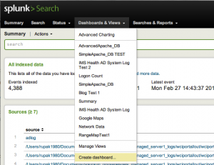
To get started, from the Dashboard & Views drop down list on the navigation bar select Create Dashboard .
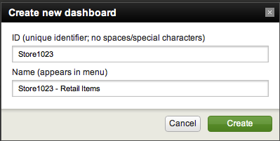
This will bring up a dialog box where you specify the ID and name of the dashboard. Try to use names that are descriptive of the data you want to display. For this example we will create a new dashboard with ID: Store1023 and Name: Store1023 - Retail Items. Click Create and you will see a blank dashboard.
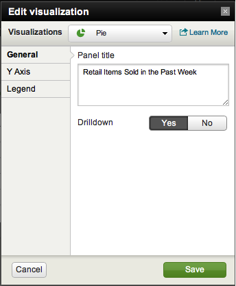
Near the top right of the screen, toggle the Edit setting to On and click on + New panel.
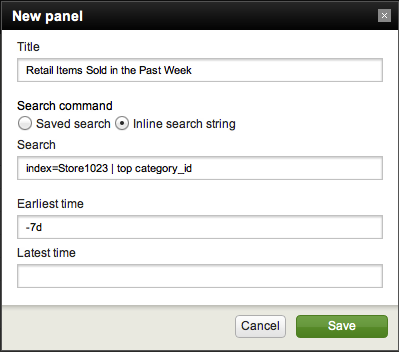
You must now provide a name for the panel. For this example, let's name it "Retail Items Sold in the Past Week". Under Search Command, either select a "Saved search", or select "Inline search string" and type in your own search. Here, I have selected "Inline search string", input my search, and set the time range for the past 7 days. Hit Save once complete.
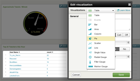
By default, Splunk will display the data in a table format, so let's change the look of data. Toggle the Edit setting to On again and click Edit and select Edit Visualization. In the drop down next to Visualizations select Pie then hit Save.
Boom! Just like that, you have a custom dashboard displaying your data in the format you choose.
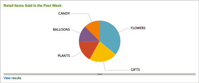
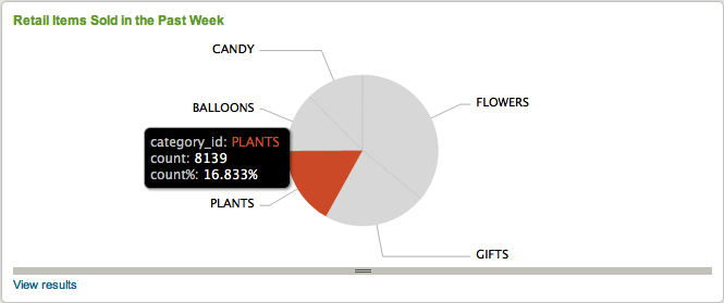
Toggle the Edit setting to Off and mouse over the sections of the pie chart to see the exact quantity of items sold.
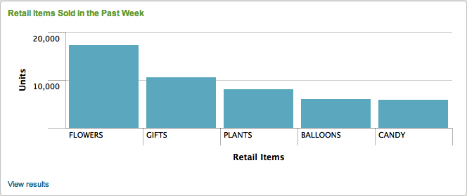
Using the Visualization Editor you can also change the name of the panel, edit the search, create/edit the name of the X and Y axes, and indicate the style and position of the legend. Let's change the visualization to column and add headings to the axes for a different look.
Check out the following video to see exactly how fast you can create a custom dashboard.
[youtube]wGthOq-CwcQ[/youtube]
If you would like to try this yourself and see just how simple it is to create your own customized dashboard, you can download the set of sample data I used at the following link: http://www.splunk.com/base/images/Tutorial/Sampledata.zip. Try creating a panel that displays the top 5 customers that shop at Store #1023 in a column graph. I bet you can complete this task in under 4 minutes!
The Visualization Editor UI creates dashboards for you in Simple XML. If you ever need to add more advanced analytics to your dashboard you can always add code to the Simple XML or even convert it to Advanced XML. The possibilities are endless! Until next time...Happy Splunking!
- Log in to post comments