Oracle WebCenter Sites Mobility vs. Responsive Web Design
If you are a Oracle WebCenter Sites (FatWire Content Server) customer, I am sure one of the questions you ask yourself is: "Is my site optimized for mobile"? With different devices such as iPads, Android Tablets, iPhone, Android phones, BlackBerrys and non-touch web-enabled devices (yes there are few of them still out there!) all in different sizes, screen resolutions and browsers, it’s tough to ensure your end users have a great experience interacting with your site. Here is where Responsive Web Design and packaged products such as Oracle WebCenter Sites Mobility Server come into play.
So what is Responsive Web Design you ask? According to Wikipedia:
Responsive Web Design (RWD) essentially indicates that a web site is crafted to use W3C CSS3 media queries with fluid proportion-based grids, to adapt the layout to the viewing environment, and probably also flexible images.
Basically what this means is that you can write something like this:
[code]
@media screen and (max-width: 600px){
.header-image{
background: url('images/tiny-header.jpg');}
}
@media screen and (min-width: 601px){
.header-image{
background: url('images/hd-header.jpg');}
}
[/code]
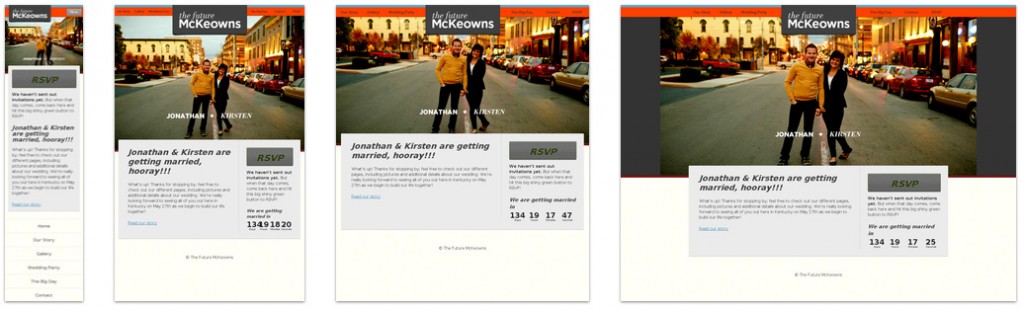
and get the following result depending on the device:
For a deeper dive into this, I recommend reading my colleague Jeremy’s post on RWD.
Sounds good so far? Ok. Now let me explain what WebCenter Sites Mobility Server is.
According to Oracle :
Oracle WebCenter Sites Mobility Server enables organizations to easily extend their Web presence to the mobile channel and effectively deliver multichannel marketing and customer experience initiatives, while also saving significant time and effort in managing mobile sites. By reusing existing web content and websites optimized for mobile delivery, Oracle WebCenter Sites Mobility Server enables enterprises to deliver an engaging mobile Web experience based on their existing online presence and brand.
What does that mean? It will plug in to Content Server and optimize your current content for mobile web. It also has additional features beyond what Responsive Web Design can do that should not be overlooked.
For instance, WebCenter Sites Mobility Server uses the GPS data on the device to deliver location based content. So now when someone searches for your store location you can provide more accurate results.
It also automatically reformats and optimizes your content including images, video and rich media for the mobile web. So taking the example we had earlier with Responsive Web Design, you would not need to generate multiple images (such as “tiny-header.jpg” or “hd-header.jpg”) Mobility Server will automatically optimize the image for the multiple devices.
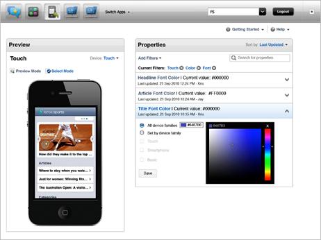
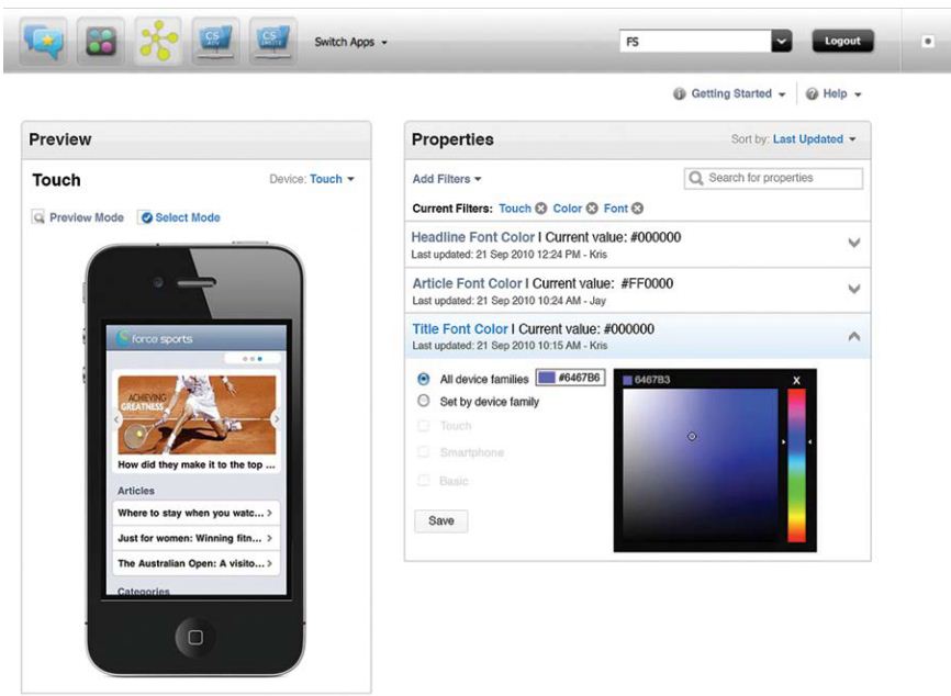
The Mobility Server features are designed for business users to make configuration changes. In my opinion, this is one of the most valuable features the product has. It presents the user with a simple user interface to make changes for how the site should behave given a particular type of device.
As you can see in the example below making changes to the color, font, images and other elements of an article just takes a few clicks.
Responsive Web Design will likely meet the majority of companies' initial need to have a mobile channel. However, if your needs go beyond simple mobile optimization of your content WebCenter Sites Mobility Server will be a better solution .
- Log in to post comments

 Function1, Inc. Copyright 2026. All Rights Reserved
Comments
Android Gadgets on June 12, 2013