Overview of the New Charting Enhancements in Splunk 7.0
Charts are highly configurable in Splunk and in Splunk 7.0 they have added more charting options to use in your dashboards. These charting enhancements improve metrics and multi-series monitoring use cases while elevating user experience.
In this blog post, I will provide an overview of the new charting options available with Splunk 7.0 and give you examples you can use for reference.
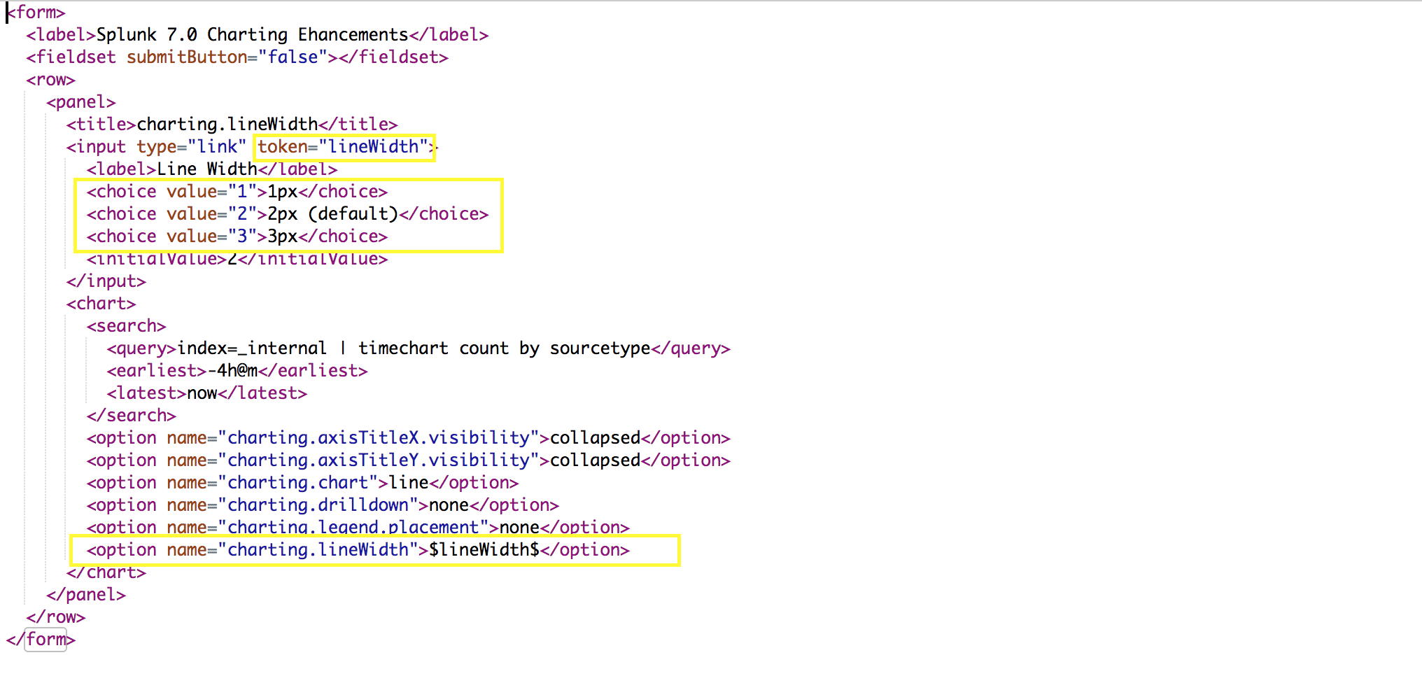
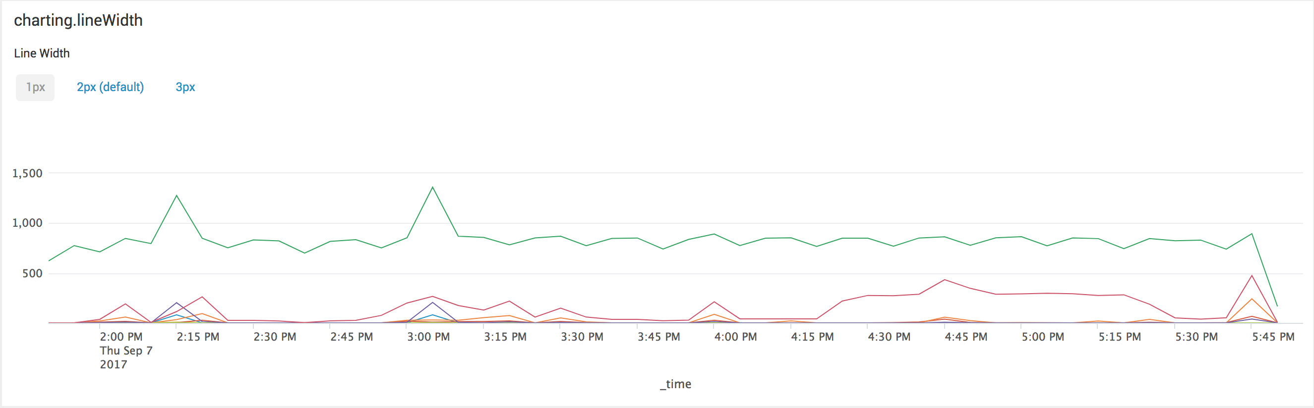
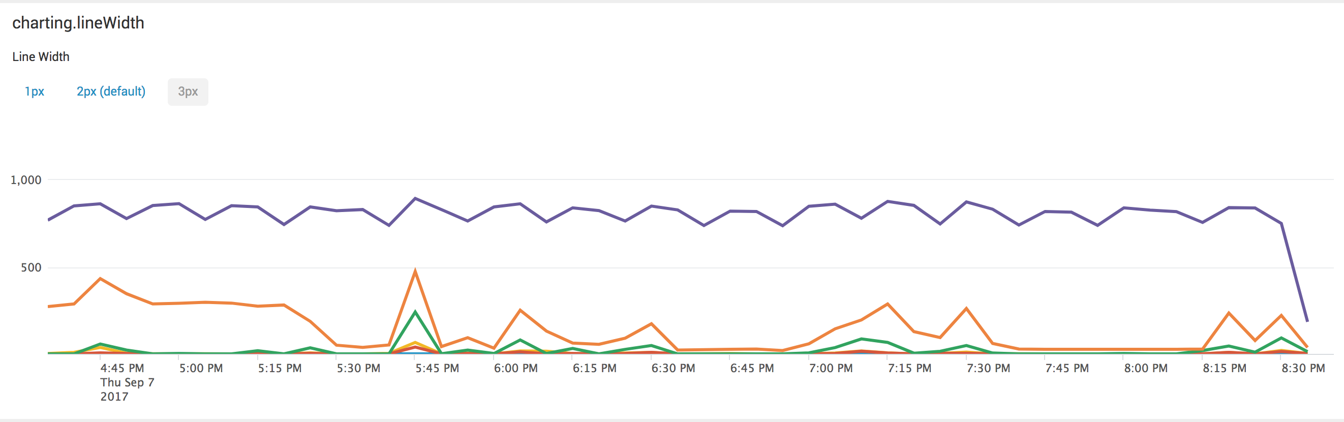
charting.lineWidth
The first charting option allows you to change the line width of your charts in pixels.
In the the XML example below, I've taken it a little further by tokenizing the value for width to give the user choices for selecting the width for the line chart.
Note that this width will apply for all line series in the chart.
Splunk also allows you to provide decimal values for the width if needed.
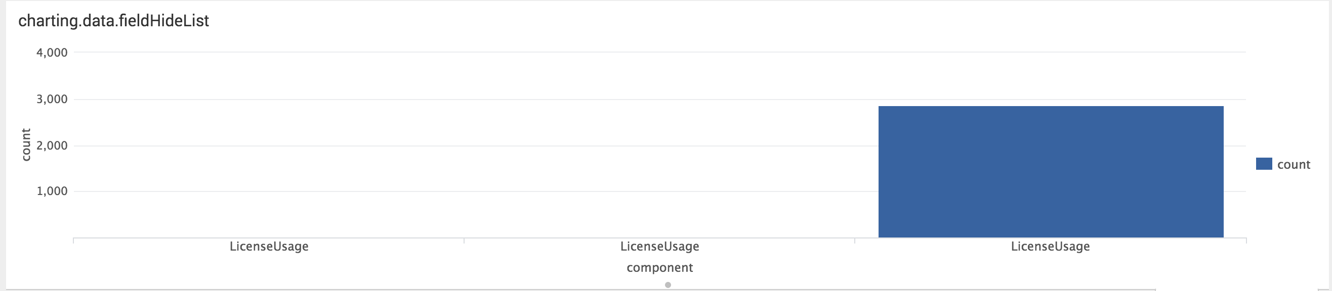
charting.data.fieldHideList
In some cases, you may want to keep the fields but do not want them to appear in the chart. This is where we can use charting.data.fieldHideList.
In this example, I'm reporting on two fields, component and type.
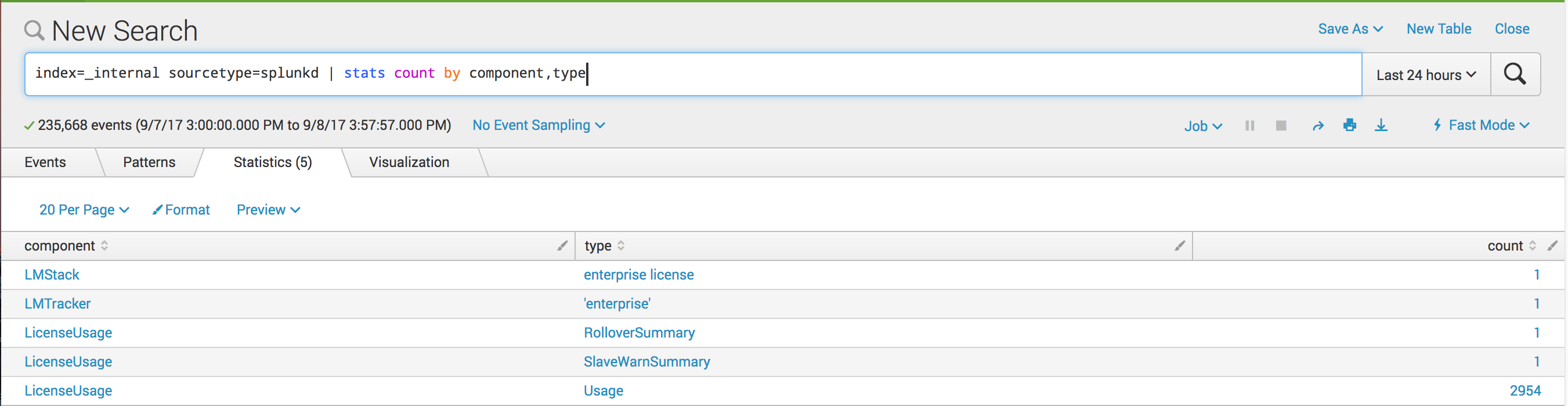
The corresponding chart looks like this:
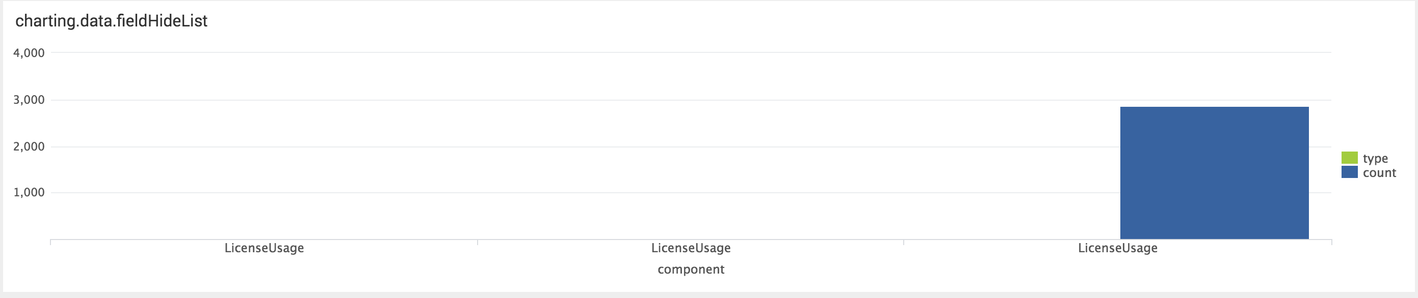
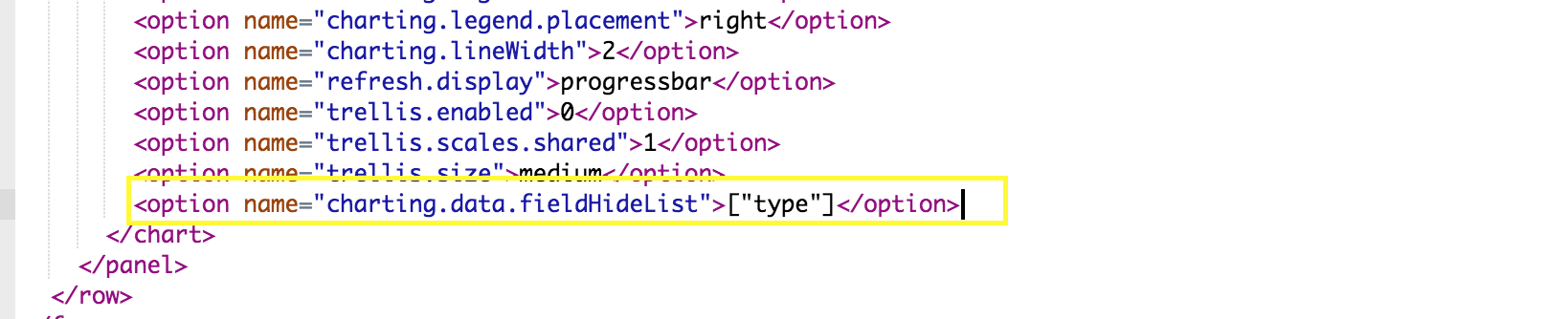
To hide the “type” field from the chart, edit xml as follows:
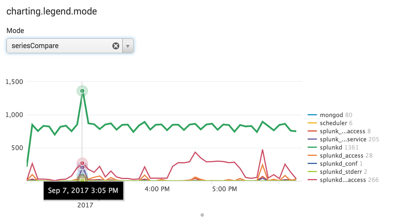
charting.legend.mode
This charting option comes in very handy when comparing different data series on a chart. The default argument is “Standard” which is what is used in previous releases for charting multi series data.
The “seriesCompare”, however, populates the values for each data series on the legend making it a lot easier to compare values at different points on the line charts.
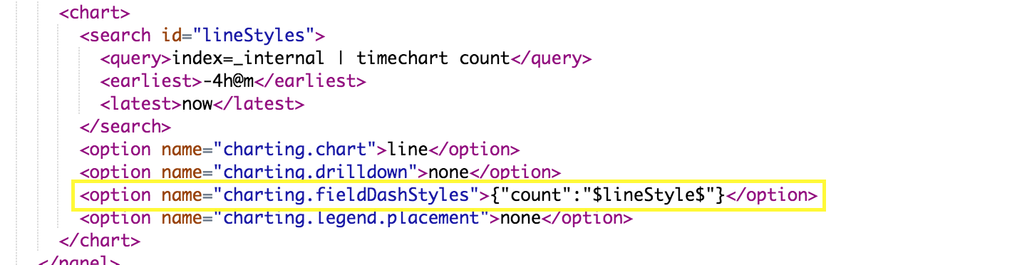
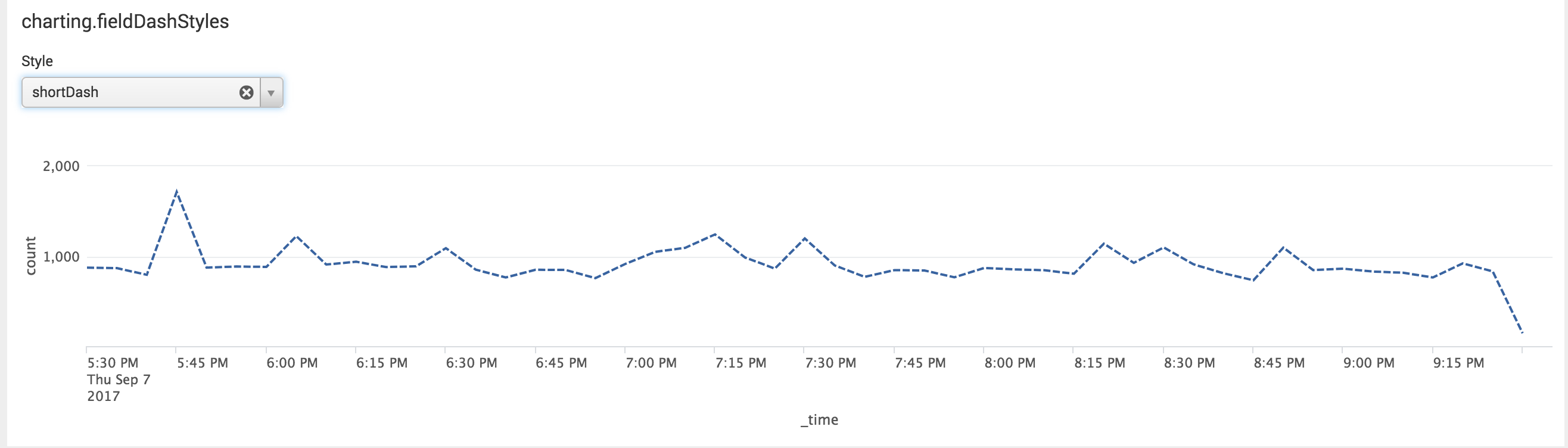
charting.fieldDashStyles
This charting option provides dash styles you can use for fields.
Possible dashboard formats include: dash, dashDot, dot, longDash , longDashDot , longDashDotDot , shortDash, shortDot , shortDashDot , shortDashDotDot , solid.
To apply a dash style to a field just use the following format:
{"<fieldname>": "<dash_style>"} in the XML
In the example below, the field is “count” and I have tokenized the dash style to give user options for selecting which dash style they want:
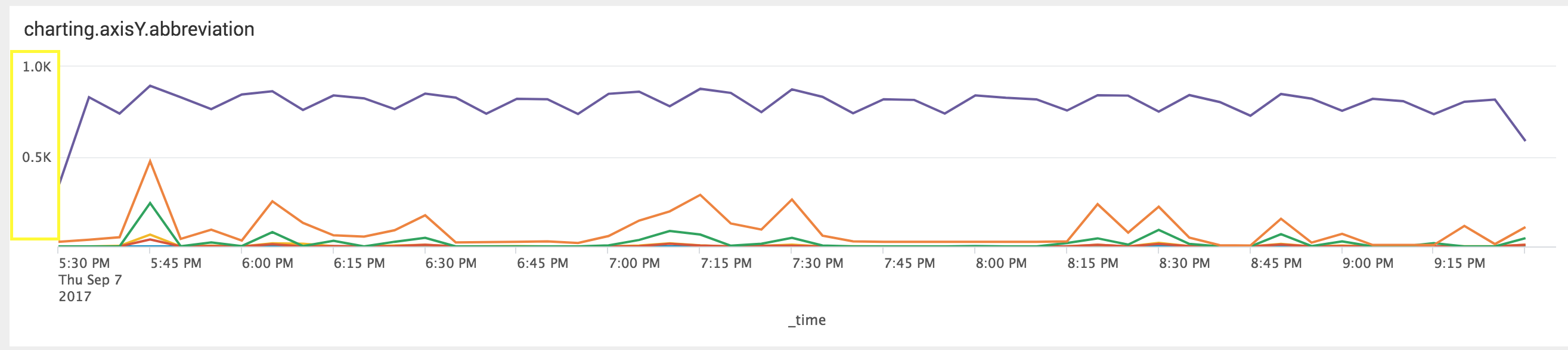
charting.axis Y.abbreviation,
Finally, these charting options allow you to add abbreviations to your or Y values using the closest SI prefix.
Charting options include: charting.axisX.abbreviation, charting.axisX.abbreviation, charting.axisY.abbreviation, charting.axisY2.abbreviation. These charting options can be set to none (default) or (auto)
Here is an example with charting.axisY.abbreviation set to none on this chart:
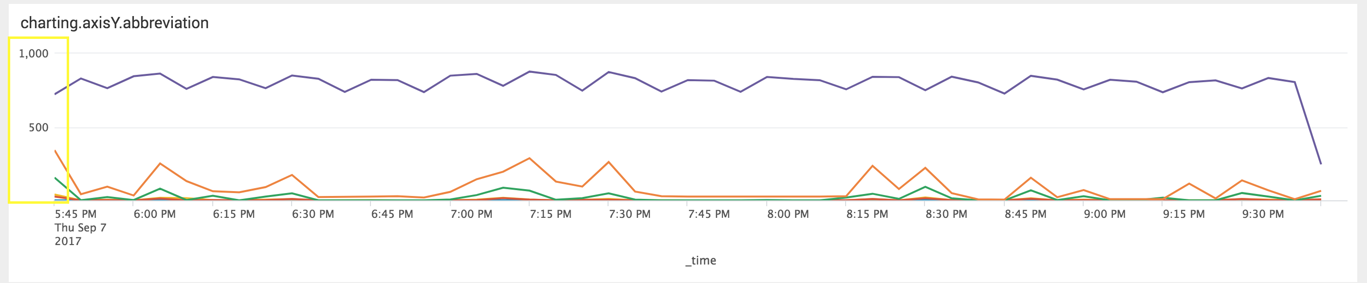
The below example is shown with charting.axisY.abbreviation set to auto:
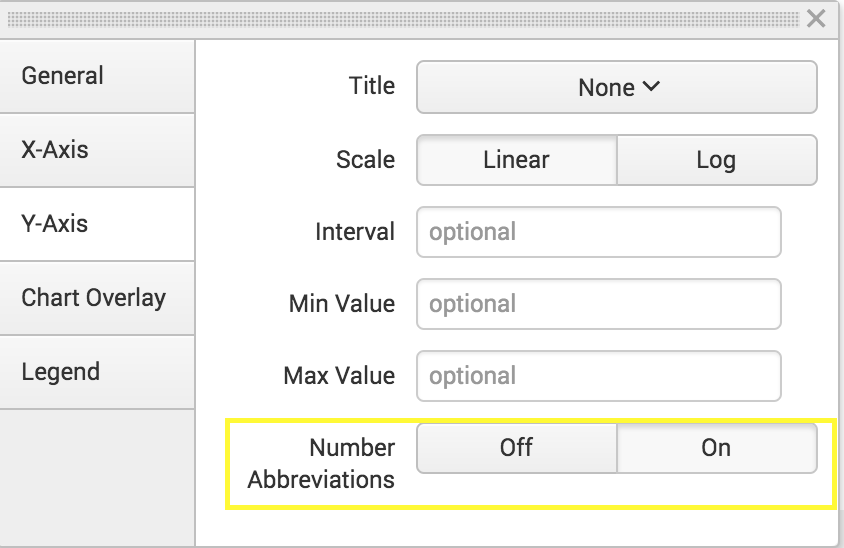
Most of these charting options will require you to edit the XML directly. This one can be edited through UI by Enabling or Disabling “Number Abbreviations":
There you have it, hopefully this overview helps to get you started with using Splunk 7.0's new charting options in your dashboards.
For further information, check out this a reference that contains all of the configurable chart properties.
Thanks for reading!
- Log in to post comments