Overview of the New Charting Enhancements in Splunk 7.0

Charts are highly configurable in Splunk and in Splunk 7.0 they have added more charting options to use in your dashboards. These charting enhancements improve metrics and multi-series monitoring use cases while elevating user experience.

In this blog post, I will provide an overview of the new charting options available with Splunk 7.0 and give you examples you can use for reference. 
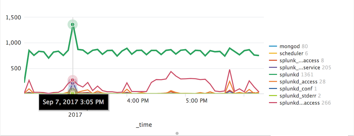
charting.lineWidth

The first charting option allows you to change the line width of your charts in pixels.   

In the the XML example below, I've taken it...


Splunk 7 Event Annotations and You!

If you're anything our team at Function1, you can't wait to experiment with all of Splunk 7's dynamic new features. One of these features is “Event Annotations,” a powerful tool to highlight charts. At the moment, Event Annotations can be used in time-series charts. They are relatively simple to use; all you need is a separate search on your dashboard of type=annotation, with the annotation_label defined as the field you want to show as an annotation, and the annotation_category defined as the field to group your annotations by type. There is a simple but comprehensive example in the...


New in Splunk 7.0 – Metrics!

Like most avid Splunk users and admins, our team at Function1 was excited to hear about the release of Splunk 7.0 and all of its powerful new features and enhancements. One of the bigger announcements was Splunk 7.0's debut of a new data type called Metrics.

Splunk’s goal in introducing Metrics is to provide organizations with a highly efficient and scalable method of ingesting, utilizing, and extracting business value out of metrics from critical IT systems.

What are Metrics … and why are they important?

In short, Metrics are numerical values that...


Stay In Touch