The Universality of Devices

Device detection is handled smartly within Oracle WebCenter Sites, but unfortunately there is no clear wiggle room if one wants to not follow Oracle’s recommendation when it comes to mobile support. The platform sniffs out if you are on a desktop or any other mobile device listed in the Device Repository (simple xml file that contains properties for each device that an application wants to differentiate upon). You might think: “Amazing! And WCS already has a file listing relevant default/common devices! I have less work to do.” For a few minutes, you are as happy can be. Until you load your page on a device other than a desktop as you are staring at the WCS Satellite servlet URL inside your mobile browser address bar.
Indeed, device detection might significantly increase the amount of work needed to launch a site across multiple platforms. Take a look at an asset type URL Pattern interface:
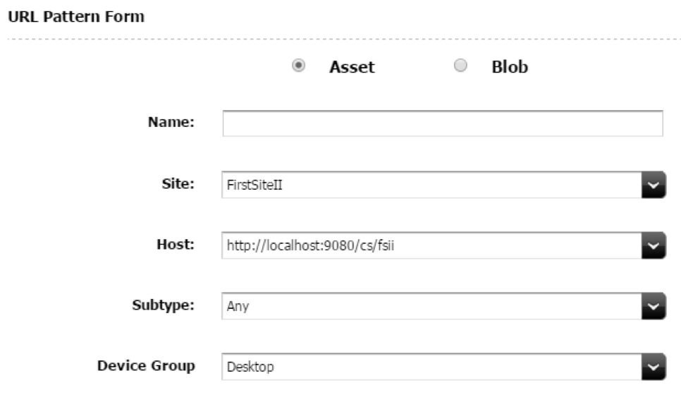
You can only select a single device group. By default WCS has a couple of pre-built device groups: Desktop, Touch, and NonTouch. The fact that you can only select a single device group per URL pattern is the issue.
If I select Desktop, only pages loaded on a desktop (laptop, traditional desktop) will resolve to their vanity URL. The autogenerated URL for every asset of that asset type will be tagged as d=Desktop.
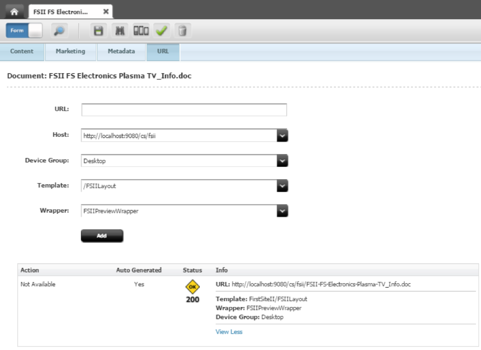
Here’s the URL tab available to view the autogenerated URL or manually created URLs:
Following our current logic, if I want vanity URLs for both desktop and mobile devices, I will have to create a second vanity URL pattern (can be the same pattern attribute value as the first one) but with a significant difference: the host should be different. WCS does not allow for identical vanity URLs. They must be unique. This brings us to a predicament: do we want our vanity URLs to be different on a mobile device? Most of the time, the answer to that question is: No. Users must be able to use desktop URLs on mobile devices. Nowadays, all of our machines are connected. We can grab a URL from our desktop and send it to our phone/tablet to view on the way to work during a morning commute. Or, a user receives his/her newsletter on their phone while browsing their email and clicks on the link to access an account on the web application. Should we have two links on the newsletter? One for desktops and another for mobiles? Not likely. It's not user friendly and it's a tad complex even if rewrite rules can come to the rescue.
At this point your mind is racing: “It actually does make sense. I can create a brand new experience for my users on mobile and differentiate from my desktop application.” True, and for some sites, this would actually be ideal: create different templates for each device group that I wish to differentiate. The amount of effort increases but if it generates the ultimate experience for your users, then it’s perfect. Go for it.
If, on the other hand, you want to keep the site simple, to the point, and familiarize users with a single experience no matter the device, then we need to think of an alternative.
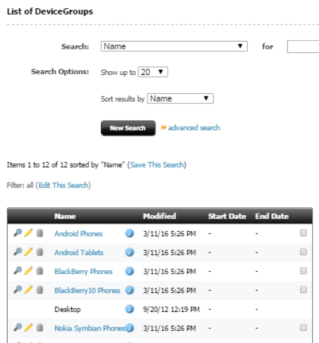
My first thought would be: let’s modify the Desktop device group. Unfortunately, you will see that is not possible. As you enable the start menus for device and device group asset types, you will soon notice that the Desktop device group is not accessible:
Not to worry. Create a new Device Group and name it: Universal. Fill out the fields as such:
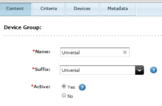
Under the User-Agent attribute field, enter: .*
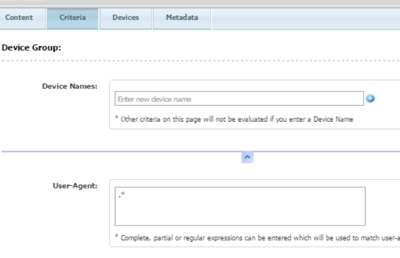
Save the new device group.
What have we done? We just created a new device group applicable to all user-agents. Every time WCS loads a page on a device, d=Universal will be picked up as an applicable device group.
Next, we need to modify the URL Pattern located under the Asset Type (Admin tab). Select Universal instead of Desktop. Save the pattern. Open the content asset, edit and save to apply the new URL:
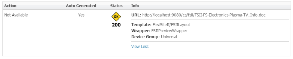
Perfect!
Now, navigate to the vanity URL on a desktop machine. Then on a mobile device of any kind. They should both load as expected and keep the URL intact.
If, for any reason, you want to differentiate some of the pages, not to worry. The following tags can handle device specificities:
- render:getpageurl
- render:calltemplate
- render:gettemplateurl
- render:gettemplateurlparameters
- insite:calltemplate
- satellite:page
- satellite:link
For instance, create a template that will be picked up by the Universal device group. Let’s call it F1/RenderContent. Create a new <someOtherDeviceGroup> device group (with proper user-agents) and another template and call it F1/RenderContent_<someOtherDeviceGroup>. In the WCS tag rendering the content, pass in the device group, which you have pre-calculated based on your very own device sniffing method:
<%

<!-- sniff out if user is on a mobile device -->

String deviceGroupCalculated = sniffedOutDevice;

%>

<render:calltemplate … >

<%if(deviceGroupCalculated != null && deviceGroupCalculated!=”Universal”){%>

<render:argument name=”d” value=’<%=deviceGroupCalculated%>’/>

<%}%>

</render:calltemplate>
If d is not specified in one of the tags listed above, the default d value (Universal) is used.
- Log in to post comments

 Function1, Inc. Copyright 2026. All Rights Reserved