Brand New: Introducing Function1's New Logo
Since its inception in 2007, Function1 has been represented by two logos, most recently one that lasted us for the past six years. Our previous logo served us well over those six years, but during that time we have been lucky enough to grow and evolve, leaving our logo feeling dated and disconnected with the Function1 of today. At the end of the summer of 2015, we embarked on a rebranding mission, one that we hoped would result in a new logo that more closely aligned with Function1 as we know it.
The Function1 Brand: A Timeline
We began our journey with the full intention of creating an entirely new icon, and many long hours went into sketching and prototyping ideas that were a complete departure from our "old" logo. We started to realize after many iterations and brainstorming sessions, that instead of a introducing an altogether new design, what we really wanted was to stay true to our roots by refreshing and modernizing our previous logo and bringing it into 2016.
Icon Iteration Process
The icon of our previous logo was developed from the concept of a keyboard button, as our name, "Function1," was derived from the F1 key. While a great idea, the intricate outlines of the icon made for an antiquated look and scaling it down caused for a hard read. Piggybacking on the original F1 key concept, we created a clean, streamlined version of our old icon and a new logo was born!
The all caps wordmark used in our last logo was strong but felt bulky and so we set off to find the perfect sleek, modern typeface to complete our rejuvinated look and feel. After completing various font studies, including experimentation with capitalization, we decide on all lowercase with the Google font Muli - and one minor tweak in changing the tittle of the "i" from a square to a circle for further modernization.
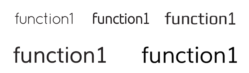
Typography Study Sample. Lower Right: Winner, Winner, Chicken Dinner.
Choosing a color scheme proved to be the most arduous leg of this adventure. We were looking for something different, but not "too different." We started out by trying various color combinations (think Microsoft or Google), it just didn't work for us. In our research, we were finding that most other firms within the tech field stick with the "safe" seclection of blue or green, which made us even more determined to steer clear of those roads. Why fit in when you can stand out? We had been using orange for a long time which felt comfortable but we were ready for a change. Put simply, the new Function1 Red just fits, exuding a boldness and passion that we feel more closely aligns with our vision as a company.
Logo Color Chart via The Huffington Post
The final result? It's something we are pretty proud of, and excited to finally put to good use in our world of enterprise technology!
We hope you enjoyed walking through our thought process and are leaving with a better understanding of how our revamped logo came to existence. Stay tuned for more updates as we are currently working towards a website overhaul!
- Log in to post comments