Creating and Using New Custom Visualizations in Splunk 6.4
Visualizations are not new to Splunk, whether XML or (D3) JavaScript, but the visualizations offered in Splunk 6.4 are the easiest and most powerful yet!
Splunk has four large improvements to visualizations:
- 12 New D3 Visualizations
- The ability to add and extend your own visualizations to the library
- Developer APIs
- An Enhanced Visualization Picker
New Visualizations
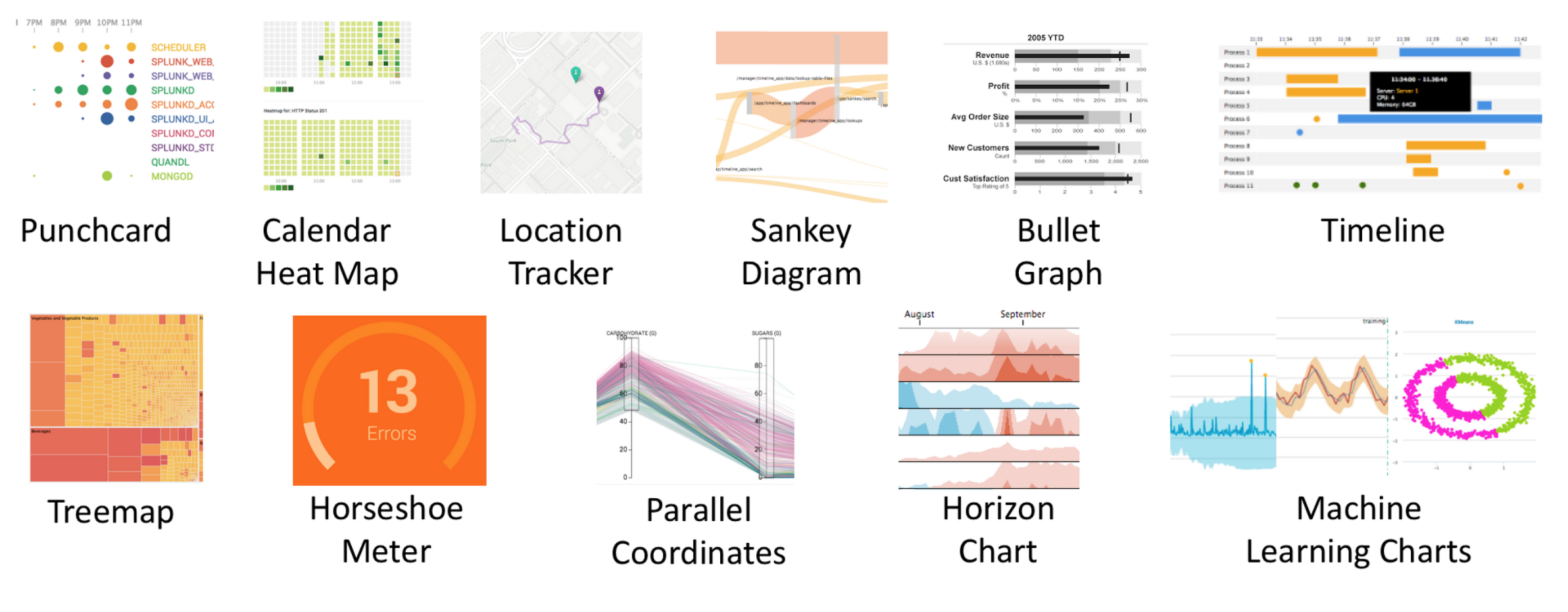
There are a lot of new visualizations available. While you can go further in depth on all of the above, I'm going to in depth on the Punchcard and Sankey Diagrams.
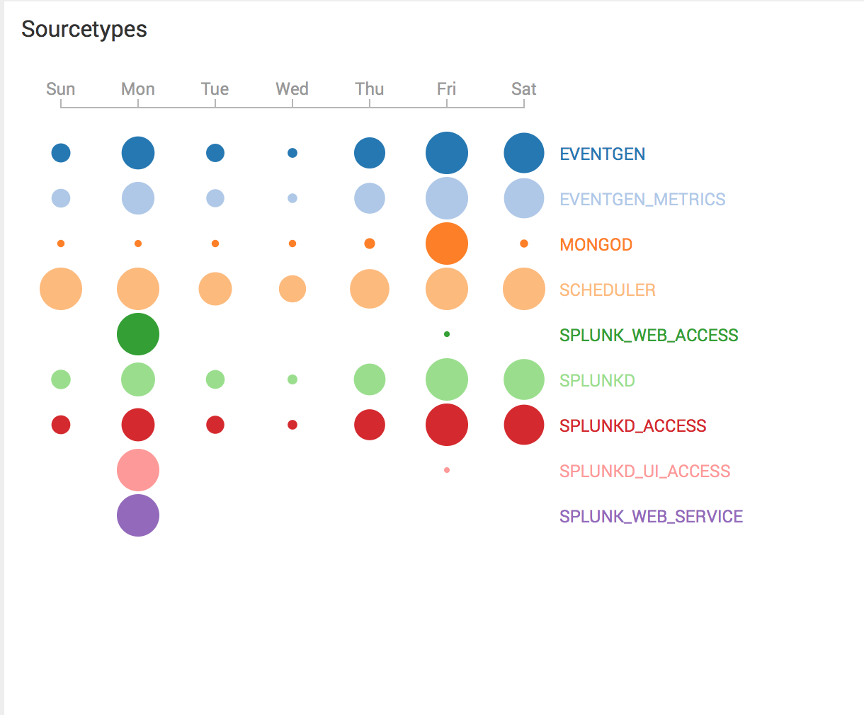
The Punchcard diagram offers a quick look that can show you what is being used the most when. You can see which indexes, sourcetypes, or other fields are being used when, and how much. Have a large data drain that you have no idea where or why it's happening? Look for the largest circles as good places to start investigating. Want to know which pages on your site are used the most by each hour of the day? You can do that, too! You can see a visualization of splunk sourcetype usage here for a sample machine that uses eventgen to create sample data:
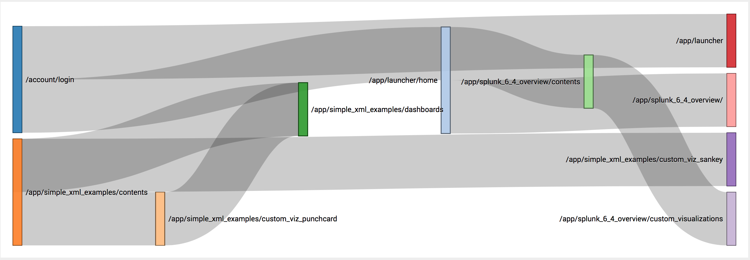
Sankey Diagrams are used more to chart a user interaction or flow through the system. You can see how many clicks it took a user to get from the home page to a purchase page, or you can see where an internal search tends to lead users and which pages are linked. User experiences are very easy to chart, Here's a simple Sankey Diagram showing my usage of Splunk for preparing for this blog post: (Yes, it's slightly meta that the final page for one path is the Sankey Vizualization page.)
Adding and Extending Your Own Visualizations
While using visualizations already included in the app is very useful, where Splunk 6.4 really earns its keep as a powerful upgrade over 6.3 is its ease of creating and adding your own visualizations! There are three ways to add a custom visualization, and in order of programming skill required, they are:
- Simple XML
- SplunkJS
- JavaScript (usually D3)
Simple XML
Hopefully, regular Splunk users are familiar with simple XML, both for dashboards and apps, but Splunk 6.4 has added a new vizualizations attribute tag: <viz>. Find yourself using the same visualizations repeatedly with slightly different datasets? Create a <viz> tag with the type of "thing_I_do_lots", like so:
<viz type="app_name.thing_I_do_lots">
... [define attrbutes and formatting that slightly change on different runs]
</viz>
And then use it:
<dashboard>
<label>Sample</label>
<row>
<panel>
<viz type="app_name.thing_I_do_lots">
<search>
<query>[whatever search I run a lot]</query>
</search>
<option name="app_name.thing_I_do_lots.attribute_that_changes">NewValue</option>
</viz>
</panel>
</row>
</dashboard>
And there you have a new custom visualization you just made from scratch!
SplunkJS
This takes a little more work, and it requires the splunkjs/mvc/visualizationregistry library. Here's how to call a custom visualization (called "custViz") from an example app (called example_app):
require([
    'jquery',
    'splunkjs/ready!',
    'splunkjs/mvc/visualizationregistry',
    'splunkjs/mvc/searchmanager'
    ],
    function($, mvc, VisualizationRegistry, SearchManager){

        var custViz = VisualizationRegistry.getVisualizer('example_app', 'custViz');

        var mainManager = new SearchManager({
            id: 'mainManager',
            search: 'index = _internal | stats count'
        });

         var myViz = new custViz({
            id: 'myViz',
            managerid: 'mainManager',
            el: $('#content')
        }).render();
});
And right away, you now have a newly customizable visualization ready for use!
JavaScript (usually D3)
While this is the most powerful visualization creator, it also requires the most work. I would suggest going through the example provided by Splunk (file structure to download here). Look for a future post with a walkthrough on creating a D3.js app/visualization to package and distribute. Using open-source JavaScript will give you the most impressive visualizations, such as hive plots, zoomable maps, or even force-directed graphs over splunkJS and simple XML, but it takes much more time!
Using Developer APIs
After creating those apps above, Splunk 6.4 has made it simple to develop APIs that are quickly packed, customized, and open source ready. These apps can be packaged to be installed through the user interface. They're customizable, for example if you have color schemes that you enjoy using or have a custom css style sheet that you use for all your (company's) apps. The open source capabilities mean that not only can you use D3, but other visualization libraries such as dygraphs.js, vis.js, or three.js.
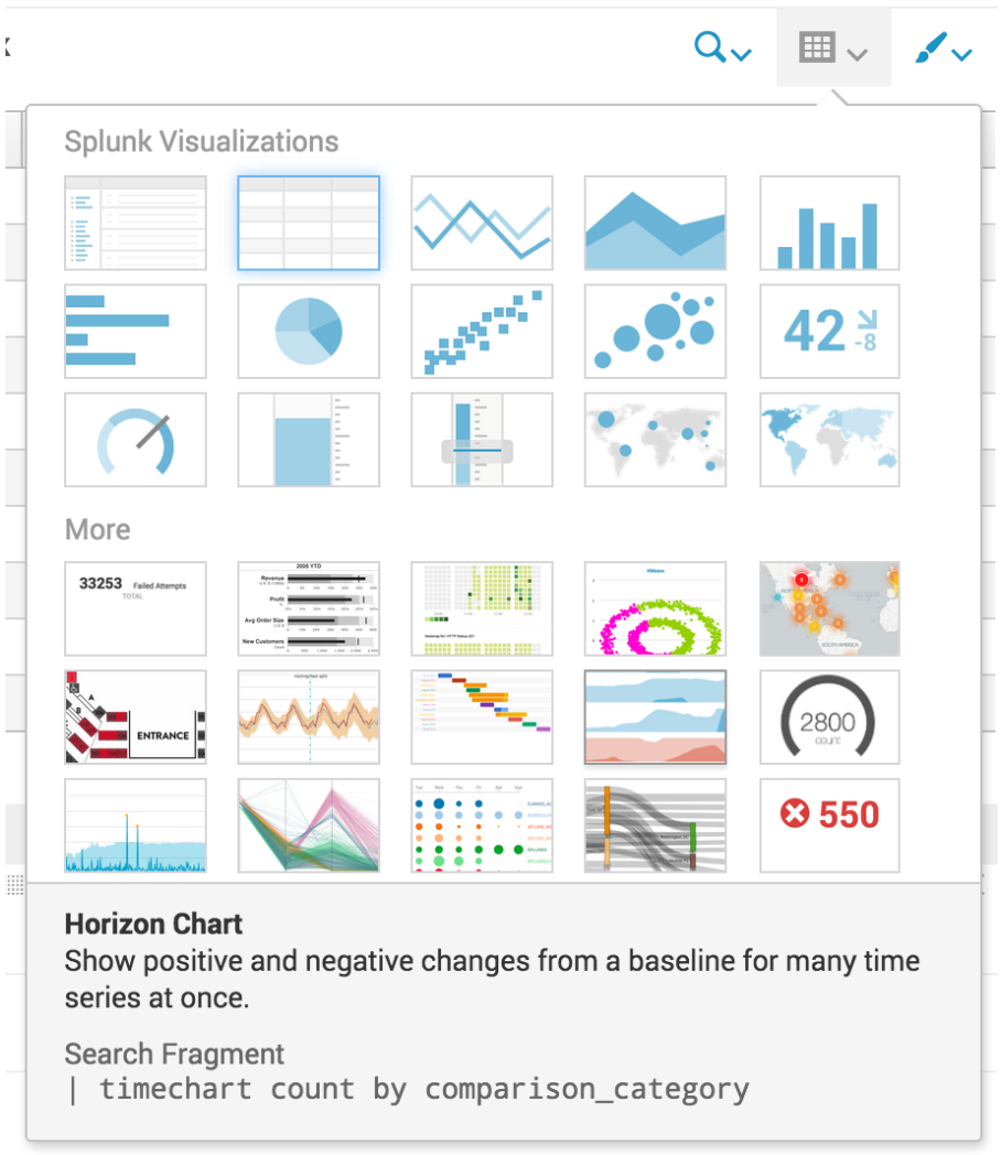
Enhanced Visualization Picker
Last, but not least, especially for those who build and use mostly dashboards and avoid app building, the new Visualization Picker is much more robust and easy to use. The screenshot below shows how many options there are and how quickly visualizations can be picked and switched as compared to previous Splunk versions.

Further resources are available on Splunkbase, specifically the Splunk 6.x Dashboard Examples app and the Splunk Enterprise 6.4 Overview app. New visualizations are here, and documentation on how to use and create them is here. I look forward to seeing the new visualizations you come up with!
- Log in to post comments